North Propulsion / Identity & art direction
Space. You know the look.
Glowing planets. Blue horizons. A spacecraft against the dark. It looks like the future. And somehow, it all looks the same.
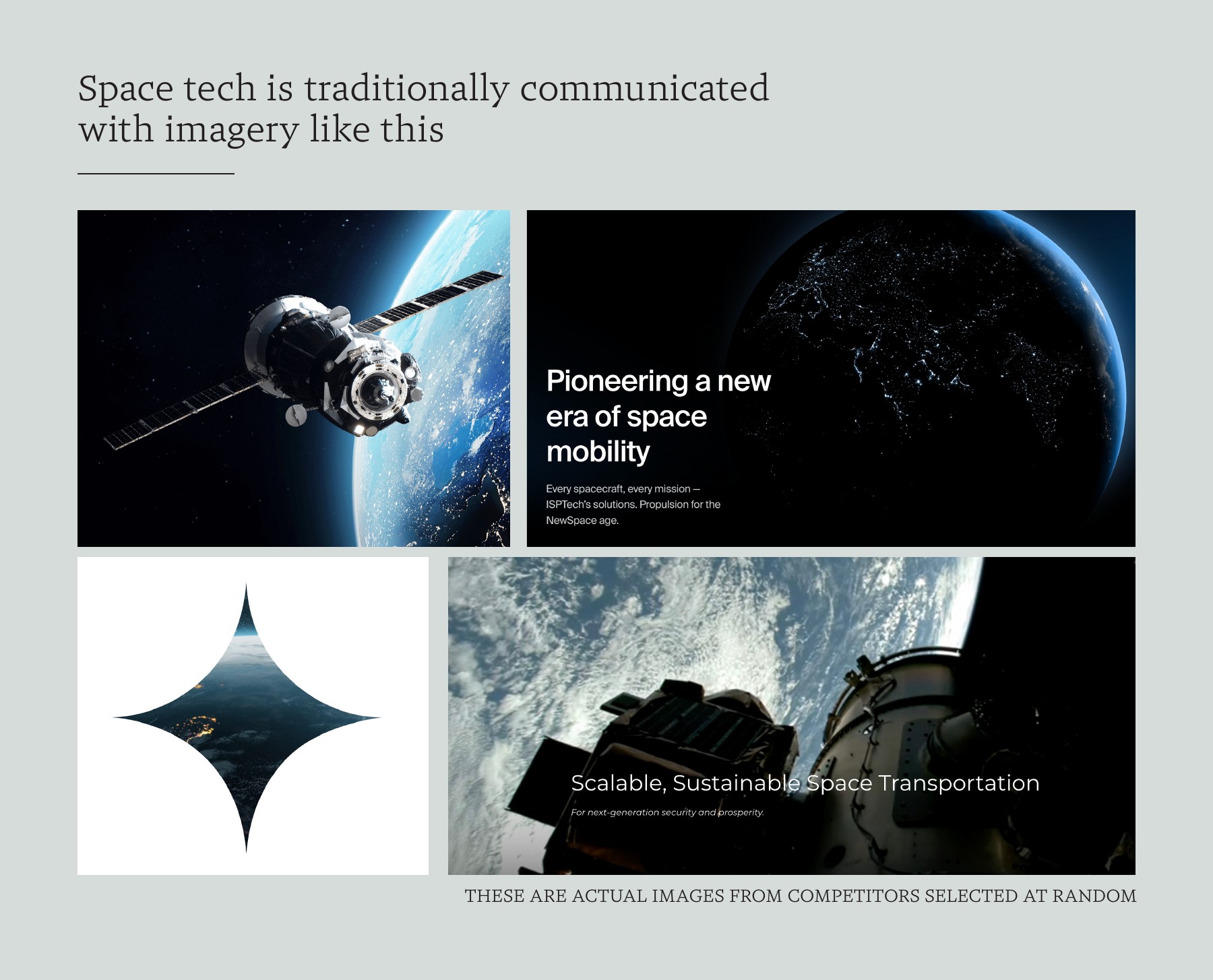
Space should be
cooler than that.
When everyone reaches for the same imagery, extraordinary companies start to look interchangeable. There is more than one way to tell a story about space.
Enter North Propulsion.
A new identity.
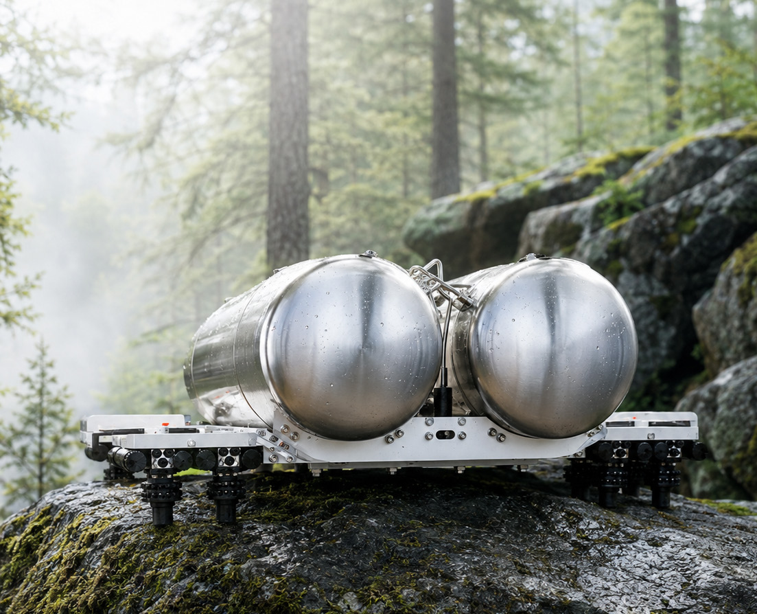
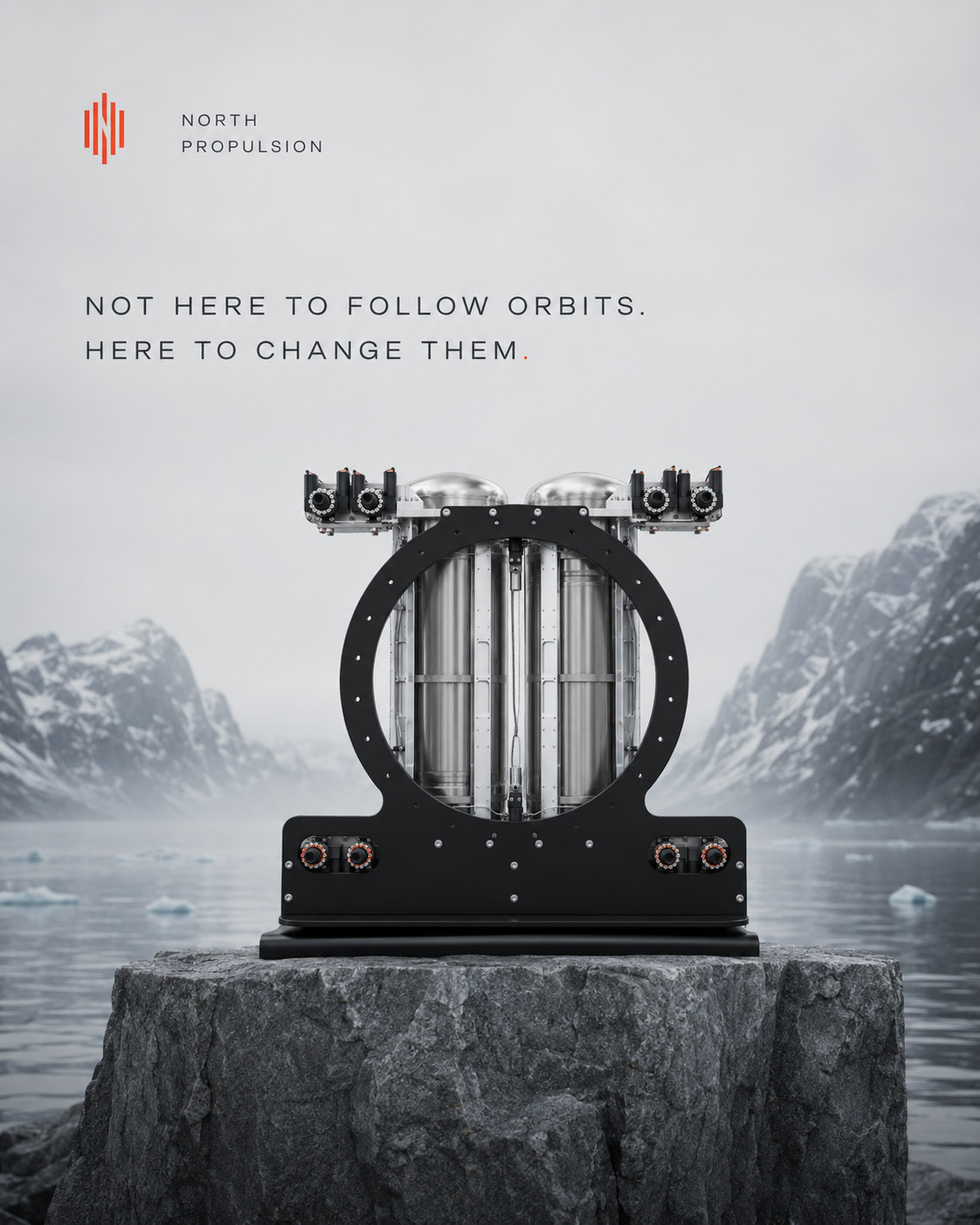
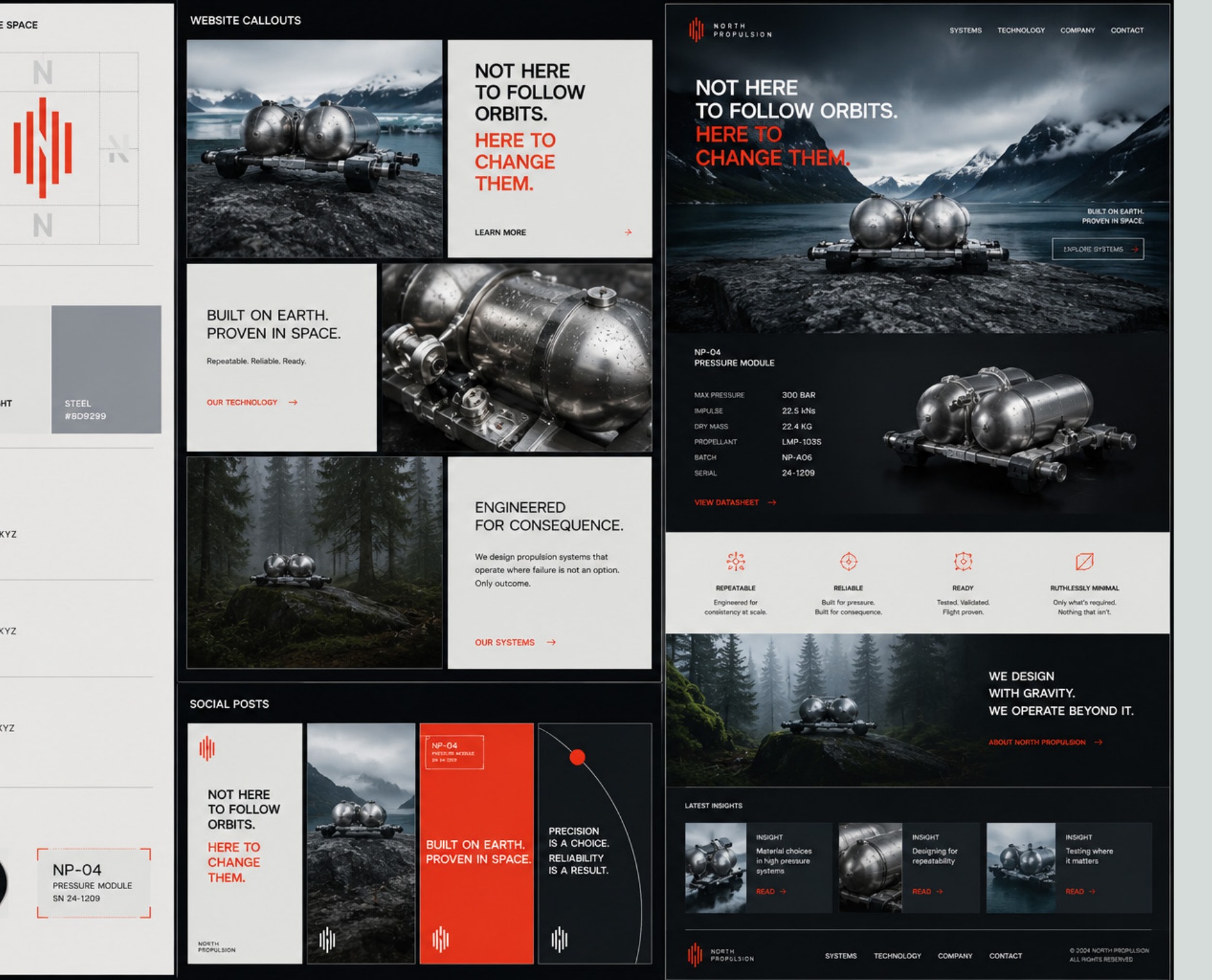
We changed the scene. Back to Earth, close to the machine. An identity built around dependable hardware, physical materials and the character of the people making it.
Find the character.
Then find the image.
The starting point was a judgement about who North is. Dependable, repeatable engineering. The spirit of a Toyota truck: built to work, built to work again. That became the creative brief, before choosing a colour, drawing a mark or composing an image.
 The North Propulsion mark
Put space hardware
somewhere unexpected.
A forest. A workshop. A slab of stone. Moving the machine into a familiar, physical world changes how we see it. Weight, pressure, surface and workmanship come forward. The setting gives the engineering a character of its own.
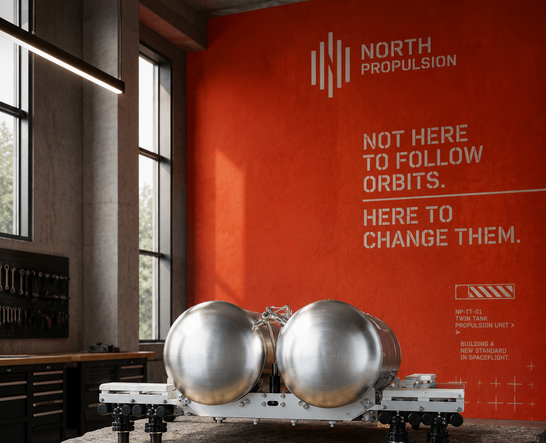
A voice with
its feet on Earth.
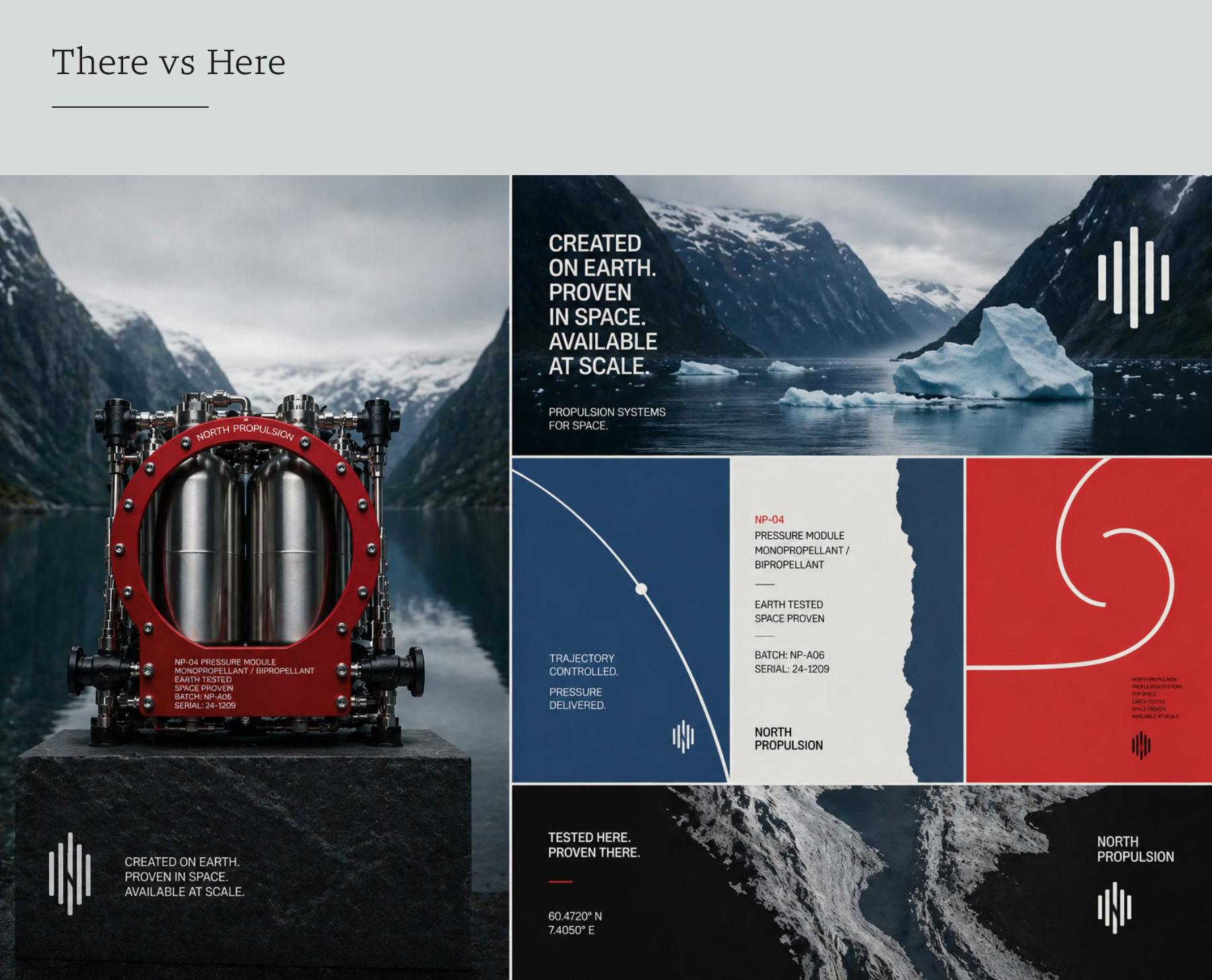
Short, direct statements. Pressure, repeatability and purpose. The presentation sets the tone: “Created on Earth. Proven in space. Available at scale.”
The language makes the same choice as the imagery. Put the work at the centre.
Colour gives
the machine a voice.
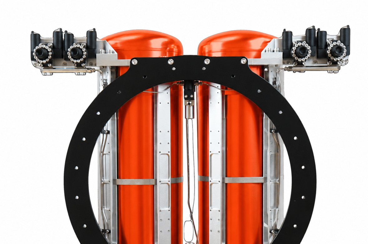
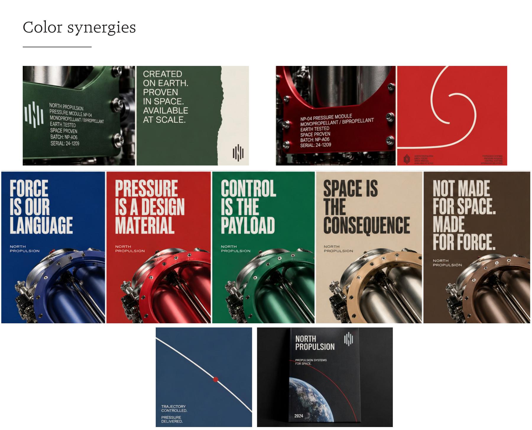
The concept explores red, green, blue and warm mineral tones against forests, rock and metal. Colour belongs to the hardware and its surroundings. It gives the brand a wider vocabulary than the familiar blue glow of space.
The difference begins
with a decision.
Recognising the expected answer is only the beginning. The creative step was choosing a different story, rooted in North’s character, and carrying that judgement through every part of the identity.
One idea.
Through every detail.
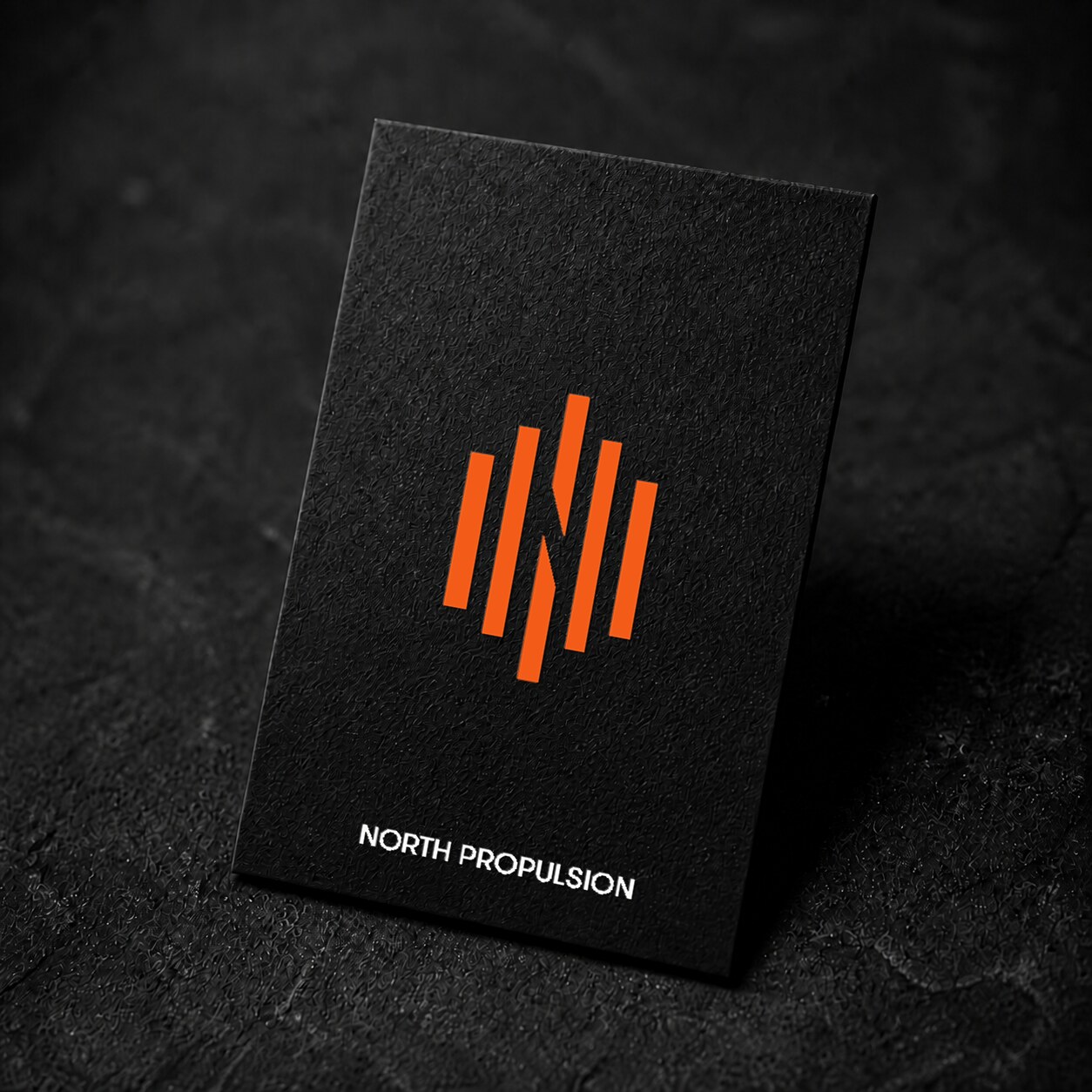
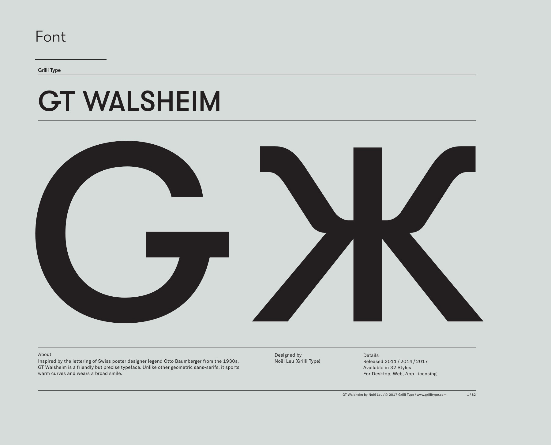
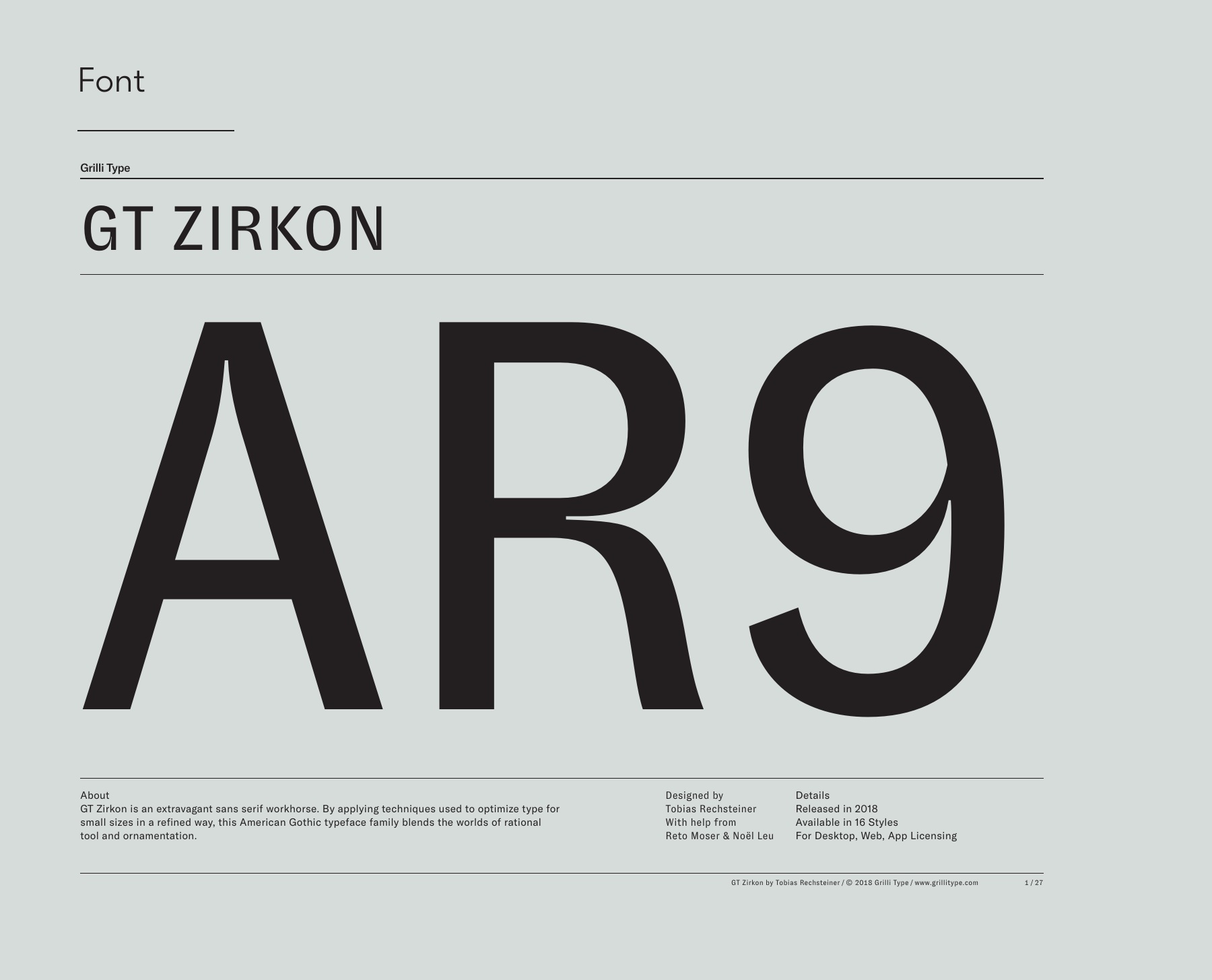
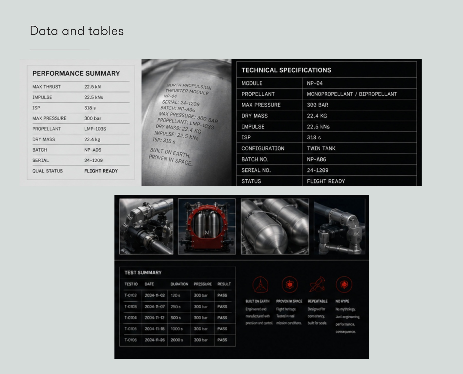
The mark, typography, technical lettering and print materials carry the same point of view into everyday use. The design manual turns the creative direction into a system that can hold together across a campaign, a product label and a business card.
Project context & credits
Threads: brand identity, art direction, design manual, print and digital applications. Typography: GT Walsheim, GT Zirkon and GT Alpina Fine by Grilli Type. Propulsion engineering belongs to North Propulsion.
Concept development shown from the Threads identity presentation, 2026.
North Propulsion ↗