ArchiveSupporting brand elements and illustrations to bring Nordpark into the 21st century
Nordpark
- Client
- Nordpark
- Discipline
- Supporting brand elements and illustrations to bring Nordpark into the 21st century / identity
- Credit
- Klaus L. Hougesen
Presentation
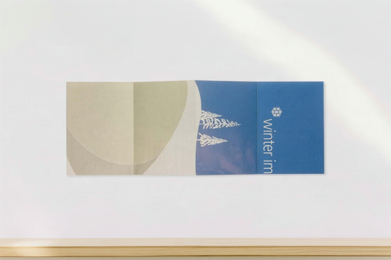
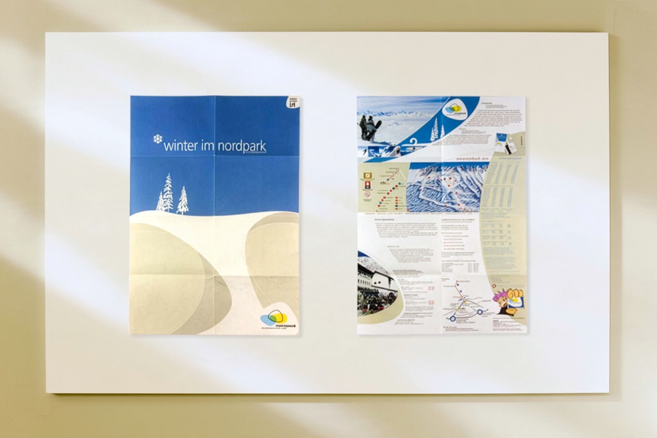
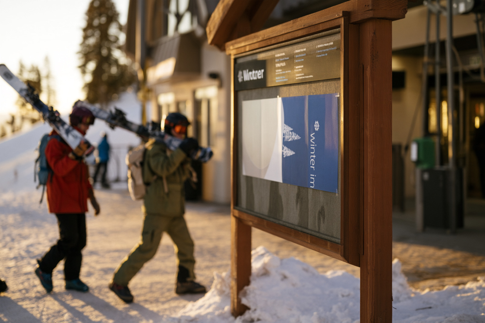
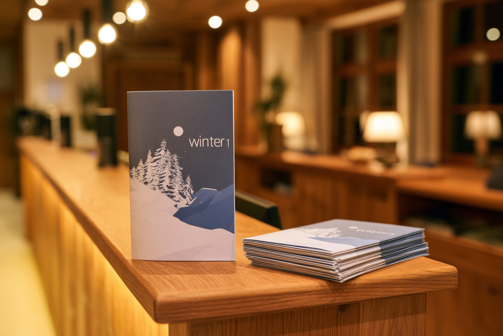
Various elements created for Nordpark / Zimmermann & Pubb to liven up their identity on the slopes
We played around with a lot of interesting concept, such as printing a Thermochromatic temperature sensor on all the slope maps.
A color scheme for each of their peak months (4 months around christmas) and graphics to support them was created to indicate time left of this years season.


Project credits
Original archive credit: Klaus L. Hougesen.