Neurokey
Corporate Visual Identity, packaging and www
neurokey is a European-based biotech company founded in 2005 and fully financed in 2007. neurokey develops first-in-class drugs for the critical care segment.
neurokey is the classic garage medicom startup, the founder are 2 hardworking visionaries with a mission to change critical care, they have received complete funding in 2007 and is a model case story, on how compounds can be found and developed from scratch without the usual problems afflicting startups in the business
It was important for the founders to underline the fact that they did things differently, and most importantly they wanted to stand out amidst others in the same area.
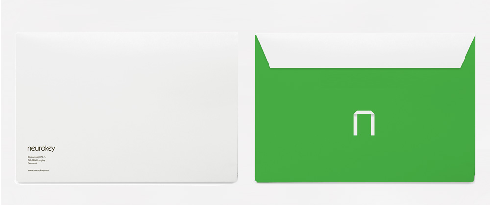
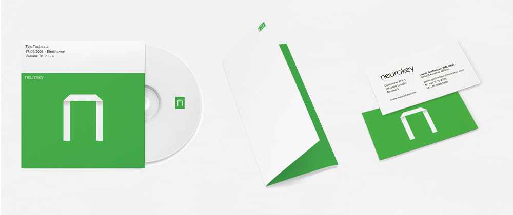
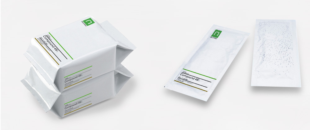
We solved that problem by eschewing the traditional bluish / soothing tones of color in the industry and using a vibrant green as the basis of the company's identity. The term "Changing the color of science" was coined as an additional reminder
The logo-mark is based upon folding molecular structures and, via special printing techniques, seems to rise from the printed matter itself.
neurokey is located in the centre of Medicon Valley, one of the biggest biotechnological and pharmaceutical clusters in Europe.


