National Pensions Reserve
Design for the Annual report 2007
This project was done with PhoenixDesignAid
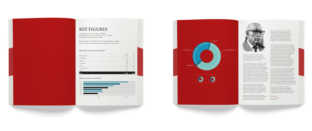
No clutter and utter clarity has been allowed to reign as the primary design decision here. The typography is clear, and the title is readable if reduced to a thumbnail on your website.
The design treatment has eschewed the standard deep blue color as a “banking / money” primary color decision, because a pension fund that has been incepted as a solution to a real and significant future problem is not about traditional banking/investment business. It is about Health, Passion, Leadership & Vigor.
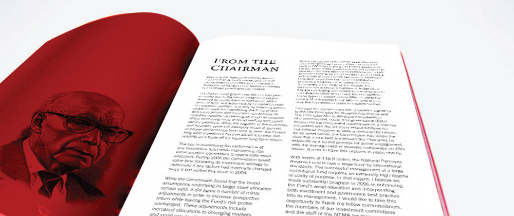
We choose to use engravings of the board and directors instead of real life photography, the decision was made to lines what photographers and painters strive to achieve in all portraits. They lend a gravitas to any subject and embed within all the work a noble, professional and to the point message.
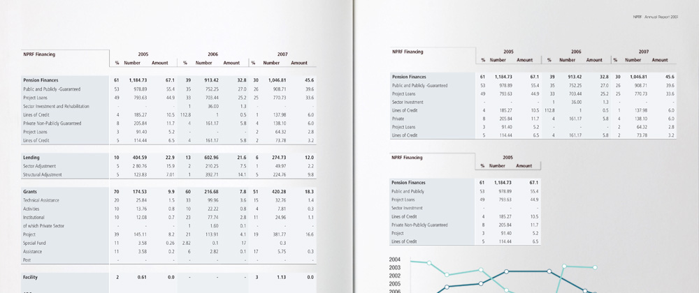
The tablatures, graphs and infographics where all trimmed to convey their content to the viewer as fast and as legible as possible. Graphs should be used for a quick informative information overview, it should give you a sense of the data not all the data. Therefore we eliminated much of the noise factor inherent in complicated graphs. and our addition of gray boxes behind the bars gives a more whole and rectangular visual impression.


